When is Capital Bikeshare faster than Uber?
This is my Capstone Project for the University of Washington’s Certificate in Data Science. Submitted December, 2017, at the completion of DS450: Deriving Knowledge from Data at Scale.
1. Introduction
Problem Statement
When is it faster to bicycle or take Uber in Washington D.C.? When you rent a bikeshare, how long will it take to get to your destination?
Every day in Washington D.C., millions of commuters take part in a giant race to determine transportation supremacy. Cars, bikes, metro train, Amtrak, buses, and more all compete against one another, but we never get much explicit feedback as to who “wins.” Todd Schneider asked this question of trips in New York City, and I wanted to extend his analysis for Washington D.C. using data from Capital Bikeshare (CaBi) and Uber.
Data Description
Washington DC’s Capital Bikeshare (CaBi) system publishes data on 16.1 million rides from Oct 2010 - Mar 2017, including start timestamp, end timestamp, start station, end station, bike ID number, and member type (casual user vs. member).
Uber recently released summarized data from Jan 2016 - Sept 2017. Uber provides data on the mean and standard deviation travel time between pairs of start/end census tracts, aggregated by month of year, week of year, or hour of day.
Finally, I obtained historical daily and hourly weather data for DCA airport from Frontier Weather, which includes daily/hourly temperature, precipitation, and weather conditions (cloud cover, relative humidity, barometric pressure, wind speed, etc.).
A note on terminology: “trip” refers to each unique start and end destination pair, in this case delineated by census tracts. “Ride” refers to each individual observation of an actual travel time for a given trip (i.e., start/end destination) at a given time of day.
2. Data Exploration & Analysis
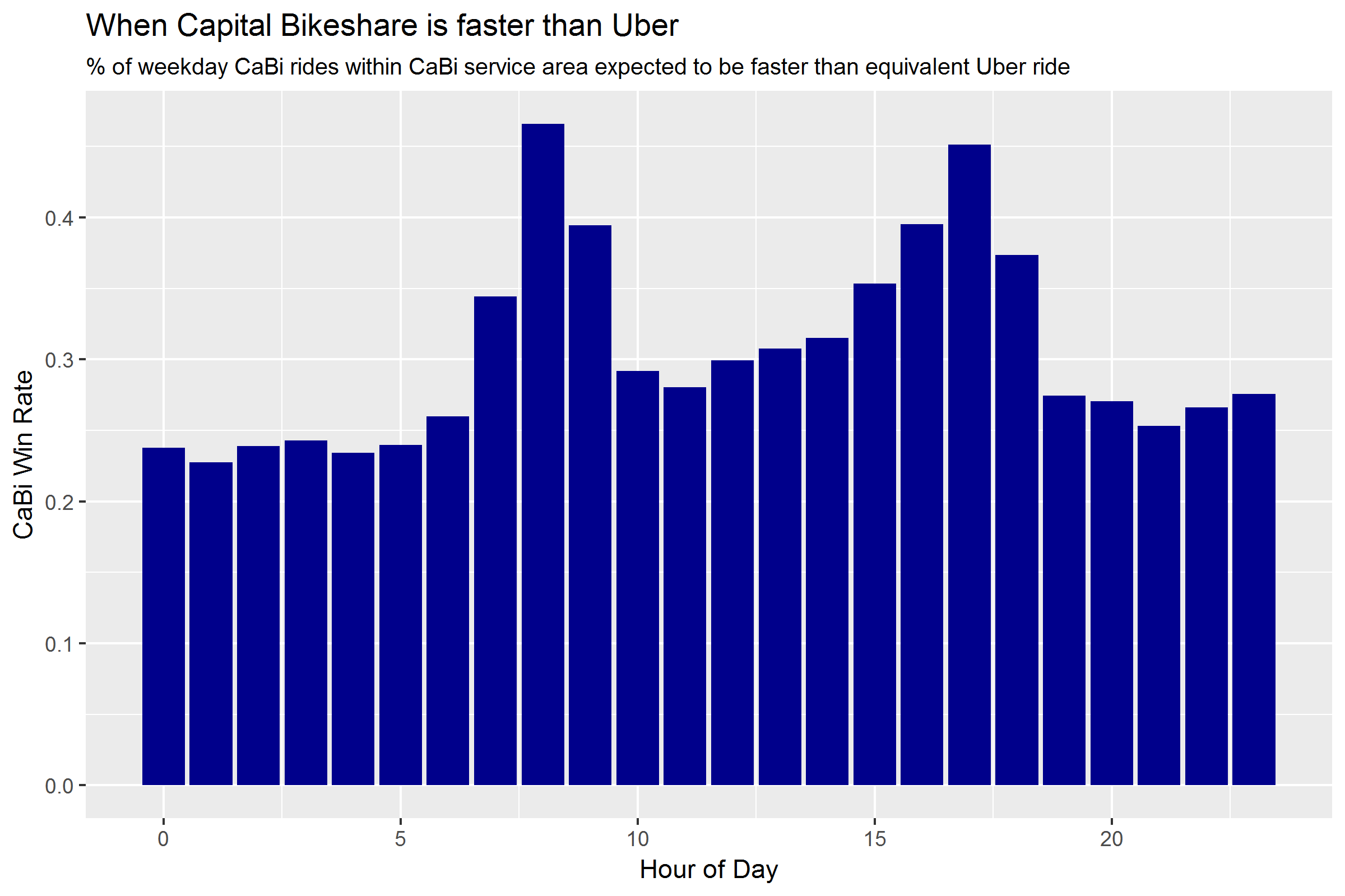
36% of weekday CaBi rides - 40% during peak hours - are faster than Uber
I estimate that 36% of weekday CaBi rides within the CaBi service area are faster than the corresponding Uber travel time, based on comparing all available CaBi ride data (Oct 2010-Mar 2017) with the latest available quarter of Uber data (Jun-Oct 2017). During peak morning and afternoon commute hours, CaBi rides beat Uber rides 40% of the time. An equivalent but less exciting way of saying this is that if CaBi riders switched to Uber, they would arrive faster 64% of the time.
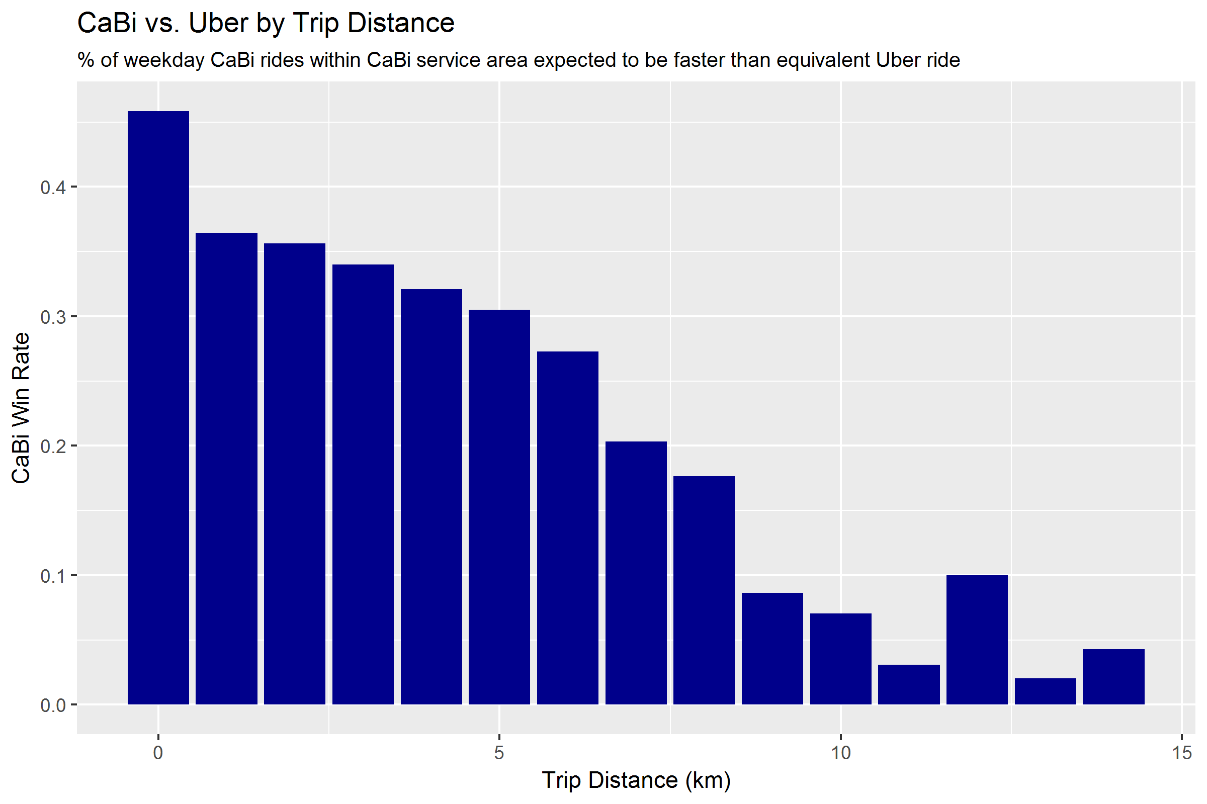
Distance is also a key determinant of whether CaBi will beat Uber. Rides of 5km and less have a 30%+ chance of beating Uber, while rides greater than 5km are less likely to beat Uber.
There are some significant caveats to this estimate. First, it assumes that the distribution of Uber rides by hour of day is the same as the CaBi ride distribution (imagine that before riding, each CaBi rider is faced with the choice of taking Uber or CaBi). Uber does not release the number of rides taken for each trip, only the average travel time. If a greater percentage of Uber rides occurs during off-peak hours - when Uber is overwhelmingly faster than CaBi - then I am overestimating the likelihood that bikeshare will win.
Practically speaking, if many Uber riders simultaneously switched to CaBi bikes, the bikeshare system would probably hit severe capacity constraints, making it difficult to find available bikes and docks. Increased bike usage might eventually lead to fewer vehicles on the road, which could ease vehicle congestion, and potentially increase bike lane congestion. It’s important to acknowledge that when I say “40% of Uber rides would be faster if they switched to CaBi”, we’re roughly considering the decision of a single able-bodied person, under the assumption that everyone else’s behavior will remain unchanged.
Additionally, trip time only describes the time between start and end destination. While Uber rides are typically door-to-door, CaBi rides exclude the time it takes to walk from the starting point to the nearest bikeshare station, and from the end bikeshare station to the final destination. On the other hand, we also exclude Uber wait time - the time between requesting an Uber ride and being picked up. These unmeasured times are likely largest as a percentage of total trip time for shorter trips - i.e., the trips that CaBi is most likely to beat Uber on.
Finally, Uber has a strong incentive to get riders from point A to point B as fast as possible (profit motive), whereas CaBi riders get the first 30 minutes of their rental free of charge. It is difficult to limit CaBi ride data to only commute rides, which are the rides most likely to be time sensitive. For more discussion, please see the Data Filtering section below.
Maps Maps Maps!
This map depicts the percentage of PM peak hour (4-7pm) trips “won” by CaBi based on the most popular starting location for CaBi rides - census tract 203, which includes Farragut Square (the heart of DC’s business district) and stations along the heavily-used M Street and L Street cycle tracks. Overlaid on the map are markers for each CaBi station.
Surprisingly, from Farragut Square, CaBi is most advantaged not in adjacent census tracts (the shortest trip distances), but in medium (<5k) distance trips across town (Union Station, H Street NE) and uptown (Columbia Heights). These are routes that have well-developed bicycle infrastructure (15th Street cycletrack, Penn Ave cycle track), but are difficult for cars to navigate due to many traffic lights and no highway alternatives.
Percent of CaBi “wins” by destination census tract, for rides originating in Farragut Square (Tract #203, in blue)
3. Modeling
What explains CaBi travel time?
I ran a linear regression to model CaBi travel times as a function of: * trip distance * hour of day * daily/hourly weather (temperature, precipitation, wind speed) * whether the trip starts/ends in DC * day of week * month of year * quarter of year * year
A linear regression is a common model choice for predicting continuous output (trip duration in seconds) with easily-interpretable results. My objective was to understand the basic factors driving CaBi trip duration.
Feature Engineering
I obtained lat/lon geo-coordinates for each CaBi station based on currently-available system data, and used the coordinates to calculated ride distance in kilometers. I extracted date and hour of day from the CaBi ride start timestamps, and applied daily and hourly weather data by merging on date and hour. The hourly weather data includes a “Weather Condition” attribute based on aviation meteorological codes- I decoded the attribute to create indicator variables for if there was rain or snow in each hour.
Additionally, I created various time series attributes from the CaBi ride date field including day of week, week of year, month of year, season, day count (number of days since start of data), and year. I tested many of the time series attributes both as numeric and factor variables (to capture non-linear relationships).
Feature Selection
I trained the model on all 2015 CaBi rides, and tested the model performance against all 2016 CaBi rides. I did feature selection by assessing each predictor’s p-value for statistical significance, evaluation of multicollinearity (particularly for the weather attributes), as well as observing overall model’s R-squared, mean absolute error (MAE), and mean absolute percentage error (MAPE) metrics on the test data set. Once I found a model variant that I felt was easily interpretable and had the best performance, I selected that regression model and assessed performance on the validation set (all Q1 2017 CaBi rides).


Model Performance
On average, CaBi regression prediction is within 2.5 minutes (MAE) or 22.7% (MAPE) of the actual ride time. This is not an exciting level of accuracy - ideally, I would like to be able to predict ride duration to within an average error of 1 minute / 10%. Further accuracy gains may be difficult given (1) the difficulty in evaluating only CaBi rides for transportation as opposed to leisure (see: Data Filtering); (2) the fact that adverse weather conditions may affect not only ride duration but also the composition of rides in ways not easily accounted for (e.g. fewer, more-urgent rides during rain could lead to faster ride times in wet conditions); and (3) need for additional predictors, such as total elevation gain for each ride.
4. Model Conclusions
Average speed is painfully slow
The CaBi regression coefficient is 4.85 minutes per kilometer which translates to a piddling 12.4km per hour! In comparison, a very simplistic regression of Uber trip data suggests an average speed of 22kph, which is still quite slow, but enough to beat CaBi rides at trips of >5km. In comparison, a decent cyclist on a flat country road should easily be able to maintain a 24kph pace.
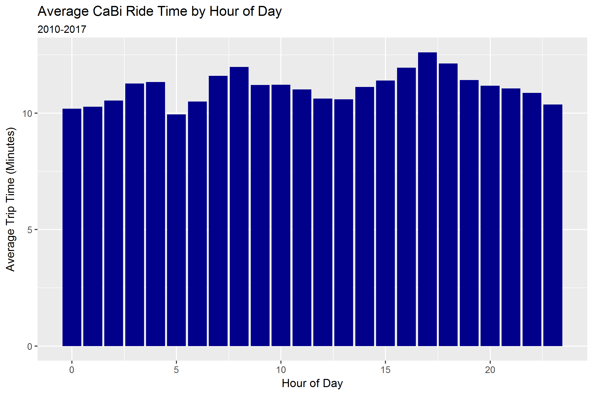
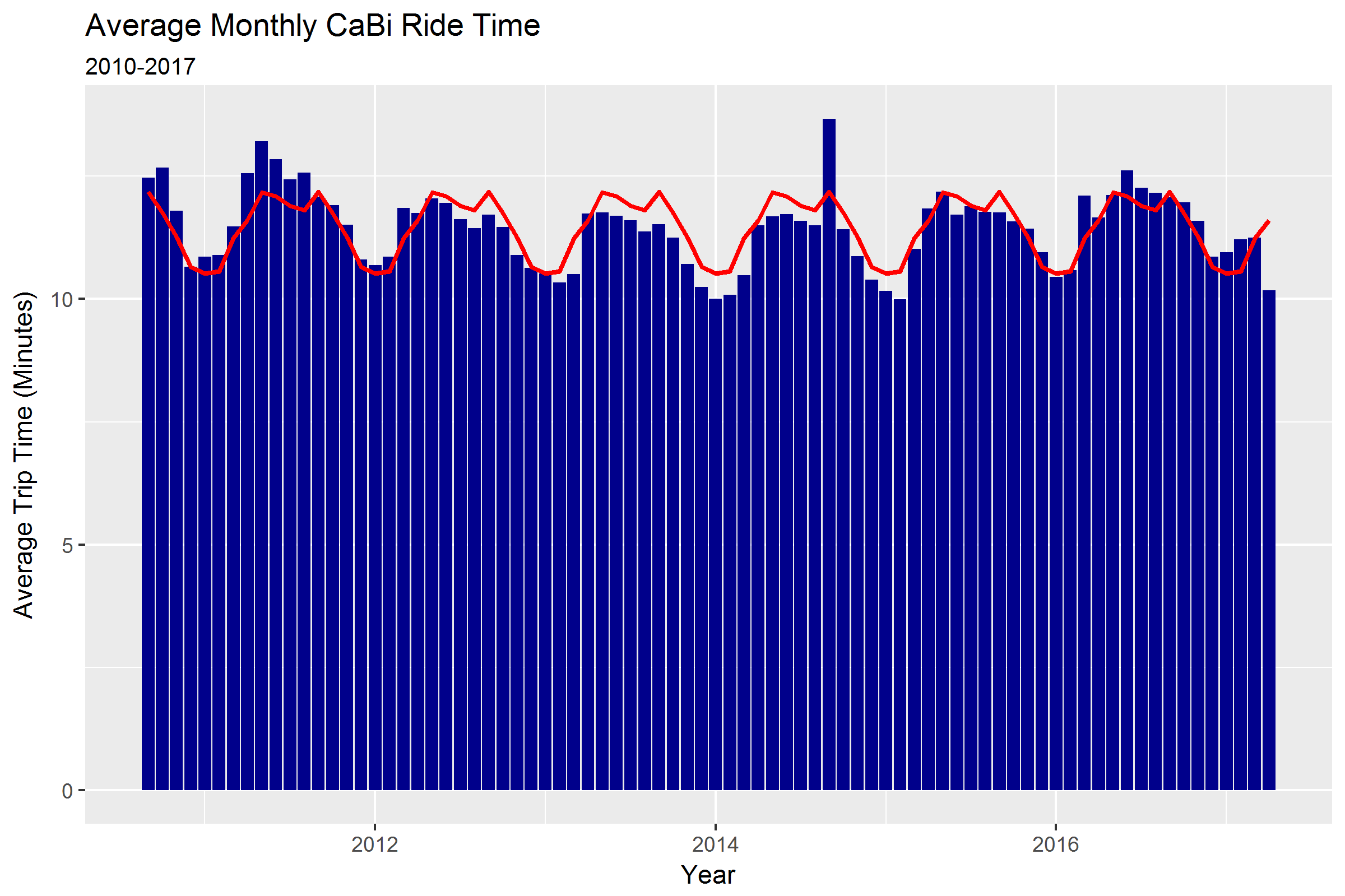
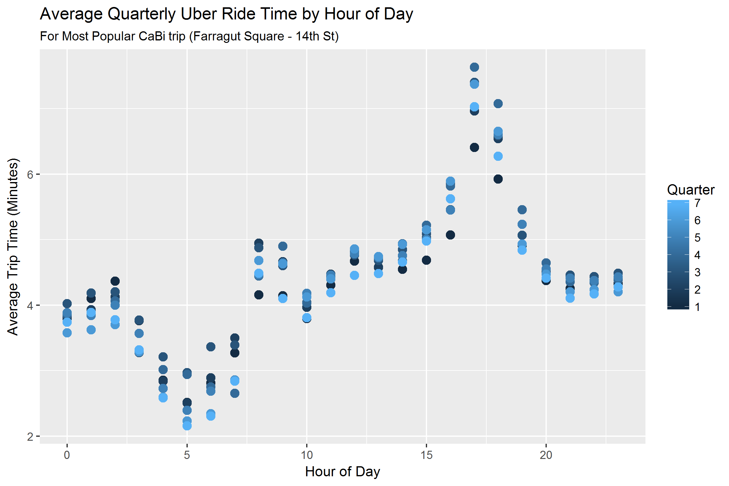
Strong seasonality by month and hour of day
After distance, seasonal effects emerge as strong predictors of ride time - ride duration peaks during AM and PM rush hours, as well as increasing by more than 1 minute in summer months compared to winter (see below).
Travel times have remained stable over time
A key assumption in comparing CaBi and Uber data is that CaBi trip times have remained stable over time. Although ride duration fell slightly in 2013 and 2014, there is no statistically significant linear trend in CaBi ride duration over time.
5. Discussion
How representative are Uber and CaBi of all cars and bikes?
It seems reasonable to assume that Ubers are representative of typical car traffic in Washington, D.C. Uber may be faster than average cars since Uber drivers’ income is tied to the number of rides and passenger distance driven - but conversely, Uber drivers are discouraged from speeding and aggressive driving by the passenger rating system and GPS monitoring.
In comparison, CaBi bikes are almost certainly slower than privately-owned bikes. CaBi bikes are designed to be slow and stable and capable of enduring heavy use and exposure, leading to design choices that lowers their speed. CaBi bikes have only three gears - compared to 21+ on a standard road bike - and anecdotally, the hardest gear maxes out at around 22kph on flat terrain. Plus, bike enthusiasts like me, who might be faster riders, typically prefer to ride our own higher-performance bikes, restricting CaBi rides to short, non-time sensitive trips. Lastly, CaBi riders may have to spend extra time at the end of a trip looking for an available dock, whereas privately-owned bikes have more parking options.
All things considered, I believe that this is a conservative analysis for bikes, and that if given data on all cars vs. all bikes, the results would be more favorable to bicycling.
What are the implications?
Although the Uber and CaBi datasets are the most conveniently available for analysis, DC residents don’t limit their choices to cars and bikes. The Metro, despite its at-times poor reputation, carries 700,000+ people every day, likely exceeding Uber and CaBi combined, so “car vs. bike” is not always the most relevant question. There are also legitimate reasons to choose a car over a bike-or vice versa-that don’t depend strictly on expected travel time.
The prevalence of bike commuting in DC nearly doubled in just five years, from 2.2% of commuters in 2010 to 4% in 2015, placing DC in third place among the largest 50 metro areas. This is likely due in no small part to the fact that people figured out on their own that biking is often the fastest option. Even with this growth, though, the data shows that a lot of people could still save precious time if they switched from cars to bikes. To the extent the city can incentivize bicycling, it will improve everyone’s transit choices.
6. Methodology
Data Filtering
I applied filters to both datasets to try to make them as comparable as possible and to try to maximize the percentage of Capital Bikeshare (CaBi) trips where the rider was likely trying to get from point A to point B relatively quickly.
For both datasets, I filtered to weekday trips only, excluding holidays. Traffic patterns are different on weekdays and weekends, and I was afraid that weekend CaBi rides would often be primarily for leisure, not efficient transportation.
Within the CaBi dataset, I removed trips by daily rental customers, keeping only the trips made by monthly and annual subscribers. Subscribers are more likely to be regular commuters, while daily users are more likely to be tourists who, even during the week, might ride more for the scenery than for an efficient commute.
Within the Uber dataset, I restricted to trips that picked up and dropped off within areas served by the CaBi system, i.e. Uber trips where taking CaBi would have been a viable option. Uber can pick up or drop off anywhere, while CaBi must be picked up and dropped off at one of the 440 fixed station locations spanning five jurisdictions - Washington, DC; Arlington, VA; Alexandria, VA; Montgomery County, MD; and Fairfax County, VA. Ten percent of CaBi stations (41) fall outside Uber’s geographic coverage for the DC metro area, e.g., Reston, VA and Rockville, MD - rides starting or ending at one of these stations have been excluded from the analysis.
The overlay map below of Uber census tract coverage and CaBi stations show that CaBi stations are not evenly distributed across all metro area census tracts. Within the District, many census tracts lack any CaBi stations (in areas of the city that are not heavily residential or business). Outlying areas of the District, Maryland (outside of Silver Spring and Bethesda), and Virginia (outside of Arlington and Alexandria) have few or no CaBi stations.
.
Uber does not provide precise latitude and longitude coordinates for every trip. Instead, Uber provides the pickup and drop off census tract for each trip, where the 558 tracts -see here for a map-roughly correspond to neighborhoods of the city. Uber also does not provide the number of rides occurring between each start and end tract - Uber only provides the mean and standard deviation travel time between tracts. Thus it is not possible to evaluate Uber’s overall geographic coverage, or the percentage of Uber trips occurring outside of areas served by CaBi.
I removed trips from both datasets that started and ended within the same census tract. For CaBi bikes, some trips started and ended at the same station, which is clearly an indication that the rider was not trying to get from point A to point B quickly. Several million more CaBi trips occurred within the same census tract, between two nearby stations. When considering trips confined to a single census tract, it seems more likely that the average Uber and CaBi trip distances might differ by a larger magnitude than trips that span multiple tracts.
For the CaBi vs. Uber comparison, I compared all available CaBi ride data (2010-2017) to the most recent quarter of Uber data (Jul-Sept 2017). This is based on testing that showed that there is no linear trend to either CaBi data or Uber data - in other words, travel times for CaBi and Uber are not increasing or decreasing over time (despite strong seasonal effects by month of year).
Technical Challenges
The three biggest caveats of this analysis are:
Uber does not provide raw ride data, only average and standard deviation travel time for each trip (pair of start/end census tracts), aggregated by month, week, or hour of day. Uber data does not include the number of rides for each trip, making it difficult to combine the monthly, weekly, and hourly distributions or to compare against the CaBi ride data. To generate comparisons with the CaBi data (e.g., “36% of Uber trips would be faster if switched to CaBi”) I had to make the key assumptions that Uber rides are normally distributed and that the relative frequency of Uber rides by time of day and start/end location are identical to that of CaBi rides, which may not be the case.
Different levels of geographic coverage. Uber does not provide precise latitude and longitude coordinates for every trip. Instead, Uber provides the pickup and drop off census tract. In contrast Cabi ride data includes start and end station, allowing me to calculate the exact Euclidean trip distance using lat/long coordinates. I assume that the distribution of ride distances for each start/end census tract is the same for both Uber and CaBi, but this may not be true. For example, are Uber rides from Union Station to Dupont Circle the same distance as with CaBi? Furthermore, by aggregating CaBi rides at census tract level, I had to exclude several million short-distance CaBi rides that start and end within the same census tract.
Limited time overlap between data sets. Given currently available data there is only 15 months of overlap between the CaBi and Uber data sets (Jan 2016 - Mar 2017). When comparing to Uber data, using only 15 months of CaBi data resulted in some trips having few CaBi rides. I therefore decided to include all 6 years of CaBi ride data in the comparison.
Comparing travel times
Dealing with large amounts of raw taxi data and raw Citi Bike data in NYC, Todd Schneider used a Monte Carlo simulation to simulate the percentage of rides won by taxis vs. bikes. I wanted to experiment with this method, and so replicated his approach for the CaBi/Uber comparison (at the cost of 6 hours of R’s processing time!).
The key difference between my analysis and Todd’s is that he compared raw taxi data to raw Citi Bike data, whereas I only had the mean and standard deviation of Uber travel times. As a result, I had to make several assumptions about the Uber data to generate a comparison. First, I assume that all Uber distributions are normally distributed (with a minimum possible trip duration of 0 minutes). Second, I assumed that the distribution of Uber rides by time of day and start/end location is the exact same as for CaBi rides. Third, I assumed that the Uber travel times do not change over time - which allowed me to use only the latest quarter of Uber data (Q3 2017). I tested this assumption using a linear regression and found that Uber rides are getting faster at a rate of 1.4 seconds per year, a statistically significant but not practically significant amount. See chart below for a visual depiction of how Uber travel times have fluctuated slightly over time.
I tried two approaches to comparing CaBi and Uber rides, both of which yielded very similar results:
Generate cumulative distribution function for each CaBi ride relative to Uber distribution. For each CaBi ride, merge on the Uber average and standard deviation travel time using the Uber distribution with the same start/end census tract and hour of day. Then, calculate the percentile (pnorm()) of the observed CaBi ride duration vs. the Uber distribution. The percentile tells us the percentage of CaBi trips that would be faster than equivalent Uber rides. Averaging across the percentile field yields the percentage of CaBi rides that would be faster than taking the same trip with Uber.
Monte Carlo simulation. Group the CaBi data into 29,611 buckets - 9 million CaBi rides bucketed by time of day (5 groupings) across 8,648 unique start/end location pairs, and subset to only the buckets with at least 5 CaBi rides. Take 10,000 samples with replacement from the CaBi ride data. Compare each of these 10,000 sampled rides with 10,000 simulated ride times randomly-generated from a normal distribution with the mean and standard deviation Uber time for that bucket. One complication is that I had to artificially combine Uber’s hour-of-day distributions into the five “time-of-day” groupings, doing so by weighting each of Uber’s hourly distributions by the relative frequency of CaBi rides in those same buckets.
These two approaches both yielded the result that 36% of CaBi rides are faster than their Uber equivalent. The first method was much faster than the second because it did not require simulating tens of thousands of observations per bucket.